
These ads help to defray the cost for hosting ONLINEPHOTOGRAPHY
 Dye transfer prints are simply without peer. They have a richness, depth, and fidelity unmatched by any other kind of photographic print. They can show extraordinary subtlety of tone and hue, combined with a brightness range of 500:1 from blackest black to whitest white. Nothing else comes close to the magnificence of a dye transfer print.
After 60 years, dye transfer printing has become a nearly-lost art.
When museums and collectors wanted the absolute finest in color printing, they called for dye transfer. But today, only a dozen or so people in the entire world still make dye transfer prints. To the best of my knowledge, I am the only artist left who makes dye transfer prints directly from color negatives. In a few years, I'm likely to be the only dye transfer artist, period!
How did this state of affairs come about? First, dye transfer printing is very time-consuming and expensive. Making the first 16" x 20" dye print from a negative costs me over $100 in materials and several days' time. Dye transfer printing also demands extraordinary skill, understanding, and good artistic judgement.
Second, dye transfer printing requires special materials which were made only by the Eastman Kodak Company. Five years ago, Kodak discontinued a special film called Pan Matrix Film which I need to make prints directly from color negatives. Two years ago, Kodak abruptly and without warning ceased production of all dye transfer materials. Presently, there is no other source for the supplies in the world, although a supplier in Texas has been investigating the possibility of providing them. Personally, I'm not hopeful; I think Kodak's actions were the straw that broke the market.
How is it that I am still making dye transfer prints? When Kodak stopped making Pan Matrix Film I faced with the possibility of never making another dye transfer print. As an artist, I couldn't stand the idea of spending the rest of my life thinking, "Gee that's a pretty nice print... it would have been so much lovelier as a dye transfer." I mortgaged myself to the hilt and packed a large amount of this unique film in a deep freeze. When Kodak ended all production, I stockpiled enough chemicals, dye and paper to allow me to print for fifteen years. I'm deeply in debt and will be for years to come, but I can continue creating my art.
That may make me the last dye transfer artist ever. Kodak's decision to kill this printing method constitutes an artistic loss of the highest order.
Dye transfer is very different from other modern color print processes. No other process gives you so many ways to control the look of the final print. That is what makes dye transfer so hard, and it is also what makes dye transfer print so magnificent. Dye transfer provides the photographic artist with the tools to express extraordinary subtleties and nuances. Color prints can be fine-tuned to convey exactly what the artist intended. In dye transfer printing, rarely is the printer limited by the process; dye transfer allows so much control that it is impossible to completely master all its possibilities.
Dye transfer dyes are much closer to 'ideal' than other photographic dyes. The colors are purer. For example, the yellow dye in a dye transfer print is very clean, while ordinary color prints have an orangish yellow which muddies greens and masks subtle variations in reds and oranges. A dye transfer print has better and more accurate color than any other color print. A dye print can have a brightness range in excess of 400:1; no other print, black-and-white or color, matches that.
 The dyes in a dye transfer print are very stable. Conventional color prints now have a light stability as good as dye transfer, but they also deteriorate in the dark. Unless you keep the majority of your work on lighted display at all times, dark fading or staining will prove more damaging than light fading. A dye transfer print has a dark-life expectancy, at room temperature and humidity, of over 300 years-- much better than even Cibachrome. Dye transfers are printed on a double-weight fibre-base paper stock which is known to be stable and archival.
Dye transfer printing resembles the mechanical printing process that magazines use to make color pictures. A color printing press uses four separate printing plates, one each for the three primaries (magenta, yellow, cyan) and one for black. Each plate is engraved with a halftone image for one of the colors, which is coated with a thin layer of oil-based ink. The four plates then transfer their ink to the surface of a sheet of blank white paper to make the color pictures. The final picture is not 'created' chemically in the paper; it is assembled on its surface from four separate screened color images.
 Dye transfer uses three continuous-tone sheet film plates called matrices. The matrices are soaked in water-based cyan, magenta and yellow dyes. The matrices are rinsed clean of excess dye and squeegeed against a sheet of gelatin-coated paper, much like regular photographic paper but without the silver compounds. The gelatin absorbs the dye from the matrix. The result is a continuous-tone dye image on paper.
The details are a bit more involved...
First, I need to separate out each of the individual color images that comprise a color negative. I use red, green and blue filters to enlarge the individual color negative images onto three sheets of Pan Matrix Film.
Pan Matrix Film is a special film that I can process to produce a "relief image": after I develop and wash the film, the thickness of gelatin left on the film base is proportional to the amount of light thathit the film.
From here on, I can work by ordinary room light. I soak the matrices in "acid-fixing" dyes. A given thickness of matrix gelatin emulsion will absorb just so much acid-fixing dye out of the dye bath. That's what makes dye transfer possible. The thickness of the matrix relief image is proportional to the original exposure, so the amount of dye carried by the matrix is also proportional. More light means more gelatin, which means more dye in the print.
The red-, green- and blue-exposed matrices go into cyan, magenta and yellow dye baths, respectively. I can adjust the contrast of each dye image by changing the acidity of that dye bath. I have sets of different contrast dyes, much as black-and-white printers have different grades of paper. Sometimes, I even use different contrasts for the different matrices to correct for some unusual color balance problem, like aerial photographs that are too blue in the shadows.
 The matrices absorb all the dye they can after soaking for 5 to 10 minutes. I rinse each matrix in 1% acetic acid to remove the excess dye from the surface; because the dyes are fixed (held in place) by acid, they don't wash out. Incidentally, the large amounts of dilute acetic acid used in the process leave the prints smelling faintly of vinegar for months-to-years after printing. Don't worry; it's normal.
Now the matrix is ready for printing. I take the first dyed matrix and squeegee it emulsion-down onto a sheet of the dye transfer receiving paper. The dye molecules migrate from the matrix to the paper. After five minutes, I peel off the matrix; I now have a primary color dye image on the receiving paper and there will be almost no dye left in the matrix. I wash the matrix in hot water, after which I can either hang it up to dry or redye it for another print. I repeat the transfer process for each of the three matrices. When I am all done I have a full color dye transfer print.
But it probably won't be right. That first print will be too light or dark, too contrasty or flat, and/or off-color. The shadows may not have the right amount of detail, or the highlights may need a little more sparkle. Or etc.,etc.
Dye transfer printing provides me with a daunting number of ways to control the appearance of the print. I can use masks when making the matrices to adjust the color balance, color rendition and tone scale of the print. I can control the density and contrast of each matrix individually during exposure and processing. I can adjust the acidity of the dye baths to change the image contrast and density (which looks different from changing the matrix contrast).
I can lighten or darken an image by changing the composition of the acid rinse baths, and I can add dye selectively to shadows or remove it from only the highlights. I can make additional transfers from each matrix to fine-tune the image. I can adjust each primary color image completely independently of the others, and I can use any combination of these effects. Learning how to judge what corrections will take me from a first print to that perfect final one is what being a master printer is all about.
Finally, I must do all of this with meticulous technique: If I don't process the matrices with perfect uniformity and consistency, I will get unwanted (and possibly uncontrollable) color shifts or blotches in my prints. Freshly processed matrices are fragile beyond belief; I must work very carefully if I want useable matrices.
I must carefully register the three color images. Before squeegeeing down a matrix, I press punched holes in the film over pins set in one end of the transfer easel and then roll the matrix onto the paper starting at the pinned end.
I use a roller to press the dye-laden matrix into close contact with the paper. If I roll too lightly, I'll get dye bleeding into the liquid trapped between the film and the paper giving me blotchy, unsharp prints. If I roll the matrix down too hard, I'll warp it slightly and get color fringes in the print. Any air bubbles or dust between the matrix and paper prevent the dye from transferring at those spots, making for much retouching and spotting later. I must do everything right while handling large sheets of wet, floppy film and paper.
It's no wonder that few printers make dye transfer prints. But the results are worth all the effort and years of acquired skills.
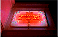
Bright reds, magentas, yellows and blues make up this strong image of a neon sign at the amusement park. The intense shadows and strong lighting make it appear three-dimensional, while the overall texture of the film grain lends a pointillistic quality.
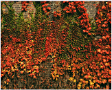
Ivy on Brick Wall, George Eastman House, Rochester NY -- 1978
Curtains of autumn ivy on the brick wall of the Eastman House garage look like a waterfall in greens, browns, yellows, oranges and reds. This is precisely the kind of image which only a dye transfer print can show off well.
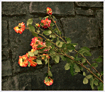
Roses Against Black Stone Wall, Portland, OR -- 1990
Photographs almost never are as realistic as this photograph from the Portland Rose Garden. Roses in yellows, oranges and pinks, with silvery green leaves, are set against a deep blue-black stone wall. Strong colors but subtle contrast.
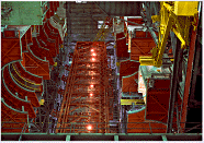
Assembly Bay and Gantry, Cape Canaveral --1975
This is one of my most popular images. It shows a Saturn assembly area inside the Vehicle Assembly Building, looking almost straight up. The brilliant, strikingly-surreal colors are a combination of the bright color scheme in which the equipment is painted and at least four different kinds of lighting in the building.
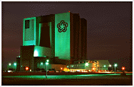
Midnight at the VAB, Cape Canaveral FL --1981
I made this image of the Vehicle Assembly Building the night before the first shuttle launch. The deep green of the mercury floodlights contrasts with the yellows and oranges of the sodium and incandescent lamps, which are also reflected in the darkly in the yellowish sky. The "small" palm trees at the base of the VAB give a hint of its enormous size.
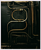
SR-71 Engine Fuel Lines, Museum of Flight, Seattle WA -- 1992
Looking like a cross between a 1930's locomotive engine and a painting by H.R. Giger, this image of the side of an SR-71 jet engine is rendered in golds, bronzes and dark sooty greys.